Medicaps Brand Identity
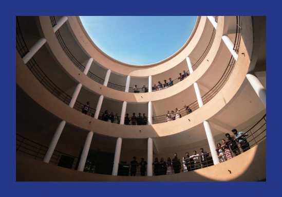
Through its existence of 25 years, Medicaps University has always been a powerhouse of learning, shaping minds and breaking barriers through academic excellence. Medicaps University continues to pave the way for academic brilliance, technological innovation, and holistic education. As it aspires to become India’s premier higher education destination located in Central India, Medicaps remains dedicated to empowering students, fostering holistic development, collaborating with industry leaders, and shaping the future of education.
The Medicaps identity reflects the university’s shift towards:
- Society-Ready Graduates
At Medicaps University, education extends beyond academic excellence, it’s about shaping individuals who contribute meaningfully to society. Through a holistic learning approach, students are empowered to think critically, act responsibly, and lead with integrity. The university instills the belief that "Knowledge is Power", equipping graduates with the skills and mindset to drive social change and make a lasting impact on their communities.
- Beyond Textbooks: The Power of Exponential Learning
At Medicaps University, education extends beyond academic excellence, it’s about shaping individuals who contribute meaningfully to society. Through a holistic learning approach, students are empowered to think critically, act responsibly, and lead with integrity. The university instills the belief that "Knowledge is Power", equipping graduates with the skills and mindset to drive social change and make a lasting impact on their communities.
- Driving Regional & National Growth
As an institution committed to progress and innovation, Medicaps plays a key role in driving economic and social development at both regional and national levels. Through cutting-edge research, strategic industry partnerships, and a strong focus on entrepreneurship, Medicaps empowers students and faculty to contribute to India’s growth story, shaping industries and fostering a future of sustainable advancement.
- Education for All: Transparency & Inclusivity
Medicaps believes that education should be a gateway, not a barrier. By championing transparency and inclusivity, the university fosters an environment where every student; regardless of background has access to world-class learning opportunities. Through scholarships, mentorship, and an ethically driven academic system, Medicaps ensures that talent finds its way to success, unhindered by limitations.
Our Promise
Learn Today,
Lead Tomorrow
Beyond ordinary, built for impact
Challenge conventional education,
provide real-world exposure
Our students don’t just graduate -
they create, innovate & lead
At Medicaps, education isn’t just about the books. It’s about transforming knowledge into action. It’s about applying what you learn, shaping it, and creating real-world impact.
Here, classrooms are just the beginning. It’s the hands-on experiences, the real challenges, and the opportunities to innovate that truly set you up for success. Every lesson, every breakthrough, every step forward is an investment in your future. Because at Medicaps, you’re not just earning a degree. You’re building the foundation for a career, a vision, and a life that matters.
The Medicaps Logo
The logo has been conceptualised on the pillars of

The Medicaps University logo, under no circumstances, is to be altered in any manner. The logo is the same for both print and digital representation and can be displayed on any media subject to the following
The Do’s
- Displaying the logomark in a proportionally reduced size due to paucity of space, etc.
- Maintaining a clear space of at least one-quarter the height of the logo used in any creativity.
- An exception can be made in the clear space only for website details.
- Displaying the logo in its monochrome versions for better contrast.
- Displaying the logo along with uniformly attached “©”, and/or “®”, and/or “TM”symbols wherever necessary and possible.
The Don’ts
- Displaying the logo with an elongation, condensation, disturbed geometry, and/or in colour other than those given.
- Displaying the logotype without all components of the logo.
- Displaying the logo with an obstructive decorative element or texture added on top of, behind, in front of, or too closely around it.
- Displaying the logo with altered spacing between the components of the logo or without ample clear space around it.
- Displaying the logo against a background that hampers its visibility.
Logo Clear Space
To maintain the integrity and visibility of the logo, ensure a sufficient margin around it. This margin should be defined by the height of the “M” from Medicaps from the logo itself.
By using a specific element as a reference, this guideline provides a clear and cohesive standard for the clear space, preventing any surrounding elements from crowding the logo. This margin enhances the logo's visual appeal while ensuring readability and overall cohesiveness within its environment.
Colors
The brand colours have been thoughtfully selected to reflect the values, enhance the visual identity, and create a cohesive and engaging brand experience.
Gradient
The gradient seamlessly blends deep blue and burgundy to create a visually engaging palette that balances professionalism and vitality. Deep blue conveys trust, depth, and authority, while burgundy adds a dynamic touch of energy and passion.
This smooth transition symbolizes the brand’s commitment to both credibility and enthusiastic engagement. The paired gradient fosters credibility and enthusiasm, adding balance to the brand’s visual identity.

Resolution - #283887
signifies professionalism, knowledgeability, and trustworthiness
Tamarillo - #A21D2E
exudes passion, energy, vitality, and commitment
Typography
The right typeface and colors are crucial for conveying messages effectively. To showcase Medicaps University’s personality, use the Metropolis font family in the specified colors across both print and digital media.
Aa
Primary Font - Metropolis
Metropolis is chosen for its clarity and hierarchy, distinguishing headings, sub-headings, and body text. Metropolis Bold ensures main headings are eye-catching and prominent. Metropolis Semibold emphasizes sub-headings, providing a clear distinction from body text. Metropolis Regular offers a clean, consistent look for body text, enhancing readability and reinforcing the brand’s visual identity.
AaBbCcDdEeFfGgHhIiJjKkLlMmNnOoPpQqRrSsTtUuVvWwXxYyZz0123456789
Aa
Accent Font - Zilla Slab
The Zilla Slab font family is used for accents and additional emphasis, available in regular and italic styles. This typeface adds a distinctive touch to specific elements, enhancing visual interest and reinforcing key messages. The regular weight provides clarity for accentuated text, while the italic style adds a dynamic, engaging quality, complementing the primary Metropolis font family and contributing to a well-rounded typographic hierarchy.
AaBbCcDdEeFfGgHhIiJjKkLlMmNnOoPpQqRrSsTtUuVvWwXxYyZz0123456789
Typefaces Use

Iconography

Pattern
This running pattern symbolises continuous movement and growth. By expanding this pattern, we create a cohesive visual experience that reflects the University’s dynamic nature and forward-thinking approach.
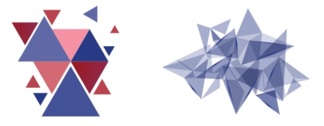
Elements
The elements for Medicaps University embrace triangular patterns derived from our logomark. The abstract approach symbolises our receptiveness to change, symbolising strength, unity, and growth.
Brand Architecture
Medicaps University is organised into various academic departments, initiatives, strategic bodies, and cells. These departments focus on specific fields of study and extracurriculars, offering expertise in those areas. This structure allows us to provide a wide range of options while ensuring each has a distinct identity.
Departments
To show the close association with the master brand identity and the importance of these sub-identities, all the present and future Academic Departments shall adopt a – Branded House – approach.
-

Amethyst - #9966CC Represents creativity, inspiration, and intellectual depth, fostering an environment conducive to innovative thinking and exploration
Crimson - #DC143C Symbolises passion, energy, and a bold approach, adding vibrancy and intensity to reflect the dynamic and groundbreaking nature of scientific discovery
-

St Tropaz - #254B8C Symbolises health, tranquillity, and clarity, creating a fresh and calming atmosphere in pharmaceutical studies
Hibiscus - #C63872 Represents compassion, care, and a touch of energy, aligning with the empathetic and healing aspects of pharmacy
-

Red Damask - #DA7D42 Conveys optimism, success, and prestige, instilling a sense of confidence and accomplishment in the field of management
Minsk - #4D2D7F Represents sophistication, leadership, and creativity, creating an environment conducive to strategic thinking and decision-making
-

Amber - #FFC104 Conveys optimism and warmth, adding a touch of confidence and enlightenment to the department's professional ambience
Chathams Blue - #144166 Exudes authority and trust, providing a stable and calm backdrop that aligns with the gravity of legal matters
-

Steel Blue - #4682B4 Represents innovation, high-tech solutions, and a modern approach, fostering a dynamic and forward-thinking environment in the field of engineering
San Juan - #2E5177 Adds depth and stability, emphasising professionalism and precision, which are essential qualities in engineering disciplines
-

Red Devil - #800020 Evokes strength, determination, and seriousness, reflecting the commitment and ambition associated with commerce
Fun Green - #007E33 Represents prosperity, growth, and financial stability, conveying a sense of trust and reliability
-

Deep Cerulean - #007BA7 Represents intellectual depth and calmness, creating a serene atmosphere conducive to learning in the AHSS department
Burn - #ED1C24 Symbolises passion and energy, adding vibrancy and intensity to reflect the creativity and dynamism inherent in arts, humanities, and social sciences
-

Christi - #7DA10C Represents growth, harmony, and a connection to nature, fostering a sense of tranquillity and balance
Eden - #115C5D Adds depth and stability, emphasising the grounded and reliable aspects of agricultural practices
Student-Run Initiatives
Student-run initiatives and clubs shall follow the – House of Brands – model. To provide complete independence and ensure a distinct brand identity all the sub-identities in the nature of student-run initiatives or clubs will fall under the House of Brands architecture.
-
Arts and Creativity Club
-
Advance Studies Club
-
Cultural Club
-
E-Sports Club
-
Forensic Club
-
Literary Club
-
Mathematics Club
-
Media Club
-
National Digital Library Club
-
Photography Club
-
Science Club
-
Social & Eco Club
-
Spiritual Club
-
Sports Club
Strategic Bodies
All the strategic bodies and key partnerships shall follow the – Endorsed Brands – model. This structure is characterised by having some synergy between the master brand, and the sub-brands.
-
MII Foundation
Includes E Cell

-
Medicap Alumni Association

-
Medicap Staff Alumni Association

-
Centre for Innovation (CFI)
includes IIC, Development Community, Motor Sports, Robotics and Techno Clubs

-
Office of International Affairs

-
Career Development Centre
Cells and Collaborations
All Cells and Collaborations shall follow a – Hybrid Model – a combination of Branded House, House of Brands and Endorsed Brand model depending upon the specific requirements of each sub-brand.
Cells
-
NSS
-
NCC
-
Anti Ragging
-
Anti Discrimination Cell
-
Greivance Cell
-
ICC
Collaborations
-
Emversity
-
Upgrad
-
Zell Education
-
Bosch
-
Ultratech
-
47 Billion
-
HCL
-
Hettich
-
IBM
-
L&T
-
TCS
-
Intel
To show the close association with the master brand identity and the importance of these sub-identities, all the present and future Academic Departments shall adopt a – Branded House – approach.
Amethyst - #9966CC Represents creativity, inspiration, and intellectual depth, fostering an environment conducive to innovative thinking and exploration
Crimson - #DC143C Symbolises passion, energy, and a bold approach, adding vibrancy and intensity to reflect the dynamic and groundbreaking nature of scientific discovery
St Tropaz - #254B8C Symbolises health, tranquillity, and clarity, creating a fresh and calming atmosphere in pharmaceutical studies
Hibiscus - #C63872 Represents compassion, care, and a touch of energy, aligning with the empathetic and healing aspects of pharmacy
Red Damask - #DA7D42 Conveys optimism, success, and prestige, instilling a sense of confidence and accomplishment in the field of management
Minsk - #4D2D7F Represents sophistication, leadership, and creativity, creating an environment conducive to strategic thinking and decision-making
Amber - #FFC104 Conveys optimism and warmth, adding a touch of confidence and enlightenment to the department's professional ambience
Chathams Blue - #144166 Exudes authority and trust, providing a stable and calm backdrop that aligns with the gravity of legal matters
Steel Blue - #4682B4 Represents innovation, high-tech solutions, and a modern approach, fostering a dynamic and forward-thinking environment in the field of engineering
San Juan - #2E5177 Adds depth and stability, emphasising professionalism and precision, which are essential qualities in engineering disciplines
Red Devil - #800020 Evokes strength, determination, and seriousness, reflecting the commitment and ambition associated with commerce
Fun Green - #007E33 Represents prosperity, growth, and financial stability, conveying a sense of trust and reliability
Deep Cerulean - #007BA7 Represents intellectual depth and calmness, creating a serene atmosphere conducive to learning in the AHSS department
Burn - #ED1C24 Symbolises passion and energy, adding vibrancy and intensity to reflect the creativity and dynamism inherent in arts, humanities, and social sciences
Christi - #7DA10C Represents growth, harmony, and a connection to nature, fostering a sense of tranquillity and balance
Eden - #115C5D Adds depth and stability, emphasising the grounded and reliable aspects of agricultural practices
Student-run initiatives and clubs shall follow the – House of Brands – model. To provide complete independence and ensure a distinct brand identity all the sub-identities in the nature of student-run initiatives or clubs will fall under the House of Brands architecture.
-
Arts and Creativity Club
-
Advance Studies Club
-
Cultural Club
-
E-Sports Club
-
Forensic Club
-
Literary Club
-
Mathematics Club
-
Media Club
-
National Digital Library Club
-
Photography Club
-
Science Club
-
Social & Eco Club
-
Spiritual Club
-
Sports Club
All the strategic bodies and key partnerships shall follow the – Endorsed Brands – model. This structure is characterised by having some synergy between the master brand, and the sub-brands.
MII Foundation
Includes E Cell
Medicap Alumni Association
Medicap Staff Alumni Association
Centre for Innovation (CFI)
includes IIC, Development Community, Motor Sports, Robotics and Techno Clubs
Career Development Centre
All Cells and Collaborations shall follow a – Hybrid Model – a combination of Branded House, House of Brands and Endorsed Brand model depending upon the specific requirements of each sub-brand.
Cells
-
NSS
-
NCC
-
Anti Ragging
-
Anti Discrimination Cell
-
Greivance Cell
-
ICC
Collaborations
-
Emversity
-
Upgrad
-
Zell Education
-
Bosch
-
Ultratech
-
47 Billion
-
HCL
-
Hettich
-
IBM
-
L&T
-
TCS
-
Intel


